
For my midterm project, I used a select sample of artists who are listed in the Tate Collection. The specific data that I investigated is that of the artists’ year of birth and where they were born. As for tools, I used both Flourish and Google Sheets to visualize and present the information. In Flourish, I created groups of artists based on their birth years. In Google Sheets, I created a pie chart to show the distribution (as percentages) of the birth locations. Finally, I combined the location and date information to create a map using Flourish.
The dates of birth provided by the sample data were uniform, so I was able to transform that information into a visualization fairly quickly. When it came to the birth location information, there was more variation in the data. Some of the locations were identified only by countries, while others included the actual cities. In addition, the locations were presented in a number of different languages, thereby complicating the uniformity of data. In order to map the locations on a world map using Flourish, the country locations had to be converted into standard English spelling. In accordance with these limitations, I cleaned the location data which also meant that all the data for one country was centralized around a single point on the map.
I decided to create visualizations for birth dates and locations specifically since this website collection is based in the United Kingdom, so I thought it would be interesting to see where the artists were from in the world. And then we can visualize the type of artists this collection has compiled given the time period. If one were to continue this investigation, tracing the artists’ travels and interactions would give even more insight into how the Tate Collection of artists was formed along with what type of artists are in it.
In designing my birth year visualization, I used gradations of purple and blue for the different years. The light purple is for the earliest birth years (1900-1905), dark purple and blue for the middle of the data (1906-1914), and the light blue is for the later years (1915-1919). These colors are not hard on the viewer’s eyes, and we can still see the contrast in representing the different years.
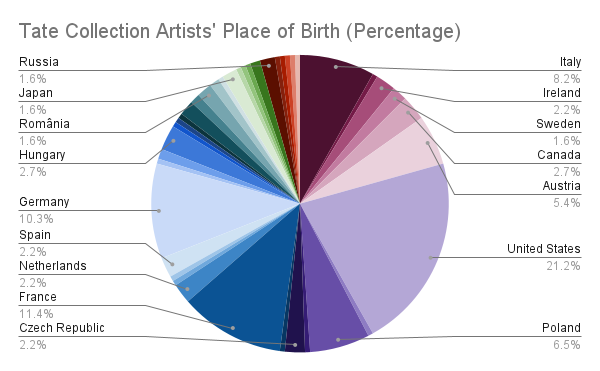
In designing the pie chart to show the distribution of countries where the artists were born, I used a similar gradation of colors. Since there are more countries than dates, I had to use a greater range of colors. I decided to use this type of chart to reveal the most frequent countries. Since there is enough data, it is possible to see the difference between the most and least common countries.
Finally, I used the previous visualizations to create a map that has information on both the artists’ year of birth and birth location. This map reinforces the most common birth locations along with the additional information of how close they are to other countries of interest. With the same color gradation as the first visual, the color of the points show the birth years. Other options for this visualization include grouping the points by year without the map or creating a stacked graph of the artists born in any given year.
By looking at all three of these visualizations together, one can see that the majority of birth locations are in the West. The map shows that the points centralize in Europe and the United States. Additionally, a significant portion of the pie chart is given to Europe and the US. This makes sense given that the collection is based out of the UK. We also get to see the breadth of the artists’ birth locations, reaching as far as South America, Africa, and East Asia. In presenting the data in this way, we also get a visual on how much information is unknown as the group of points on the side of the map shows artists for whom the birth location is unknown. The points stacked by year allow the viewer to easily see the number of artists born in each year. There may be too few birth years in this data to find a solid correlation or pattern between the dates and locations. If one were to work with more data and more years, another step that could be taken with this data is to map how the birth locations of the artists in this collection change over time.